

Problem Overview
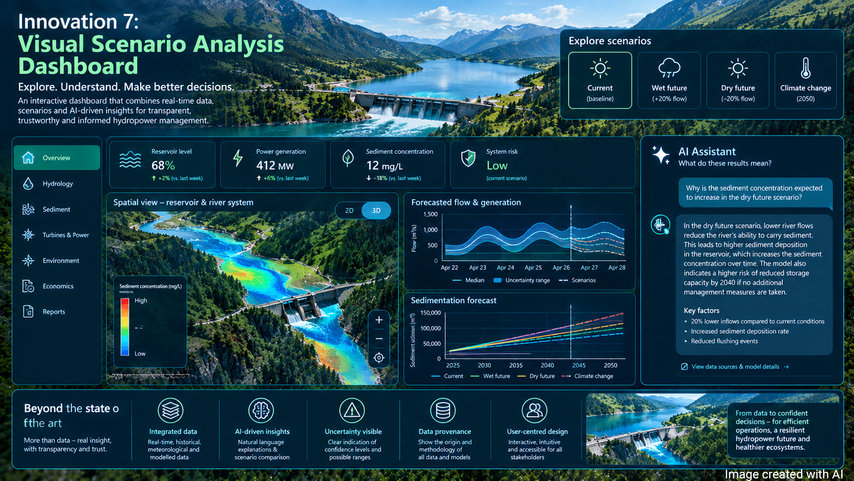
Visual dashboards are integrative interfaces that present data through a combination of charts, maps, indicators, and narratives, to make complex information accessible at a glance. They serve as tools for monitoring, comparison, and exploration by aggregating heterogeneous datasets into coherent visual summaries. Unlike static reports, dashboards enable interactivity, allowing users to filter, drill down, or adjust the temporal and spatial scope of the data. Visual dashboards have become central instruments for making complex datasets understandable, interpretable, and actionable. Their primary benefit lies in reducing cognitive demands, enabling non-expert audiences to engage with information that would otherwise remain inaccessible.
State-of-the-art approaches for visual dashboards include technological advances like responsive design, guidance, and explanations. With a visual dashboard, users can interact with data, enhancing personalization and adaptability. Empirical evidence from different domains (e.g., public health, environmental monitoring, and civic engagement) shows that the visual data exploration increases user trust, fosters informed decision-making, and empowers citizens to participate in data-driven discourse
Innovation Details
Existing visual dashboard solutions mainly concentrate on displaying the raw data or aggregated versions of the data. To serve as critical interfaces for communicating complex datasets, it becomes increasingly essential that dashboards not only present indicators but also make explicit the uncertainty inherent in the data and the origins of the underlying information. Conventional dashboards often obscure these aspects, leaving users with a false impression of precision and limiting their ability to interpret results critically. Recent advances in large language models (LLMs) offer new opportunities to address this gap.
By generating natural-language explanations, LLMs can contextualize uncertainty, clarify how values were derived through aggregation or modelling, and expose data provenance in accessible terms. This dual integration of uncertainty representation and narrative support has the potential to significantly increase user trust, improve interpretability, and foster more informed engagement with public information. In this project, we will develop a visual scenario analysis dashboard which will enable users to explore, understand, and analyse different scenarios based on the data collected in the project. We will especially focus on the explainability of the results. Coupling dashboards with LLM-driven explanatory support represents a promising direction for creating transparent, inclusive, and trustworthy data communication tools.
WP Lead parther:
Tu Wien